
How Visual Data Pipelines Accelerate Collaboration Between Business and Technical Teams
Discover how visual data pipelines bridge the gap between business and tech teams, ensuring streamlined communication, error reduction, and faster insights.
Ever notice how data teams and business analysts seem to speak completely different languages? Tech folks think in code and frameworks, while business minds focus on metrics and insights.
Visual data pipelines accelerate collaboration between business and technical teams by acting as the translator between these worlds. As data gets more complex by the day, these visual interfaces have become the bridge that makes cross-functional collaboration possible.
What are visual data pipelines?
Visual data pipelines are graphical representations of data flows that illustrate how data moves through various transformations from source to destination. These intuitive interfaces have evolved from traditional code-based ETL processes to provide a more accessible way of designing and managing data integration workflows.
Think of them as a shared visual language where both technical and business users can understand the same data workflow. This closes the communication gap that typically exists between data teams and other departments.
Modern tools keep the visuals and underlying code in perfect sync. This offers the best of both worlds—technical users can dive into the code when needed, while non-technical stakeholders can grasp what's happening through the interface.
Many tools now store code in open formats, like GitHub repositories, rather than locking data processes into proprietary black boxes. This approach makes everything transparent, enables version control, and fits naturally with existing development workflows.
Here are five ways in which visual data pipelines are helping business and technical teams speak the same language.
Visual data pipelines accelerate collaboration
Visual interfaces create common ground where both technical and non-technical team members can understand and collaborate on data workflows. It's like finding that perfect translator who helps everyone in the room communicate clearly, enhancing data collaboration.
Visual data pipelines can also help you speed up pipeline development, as Amgen experienced. Locked into Alteryx for data preparation, Amgen’s FIT team struggled to scale up to peak processing and onboard new team members due to the need for proprietary code knowledge.
Visual tools, powered by AI, helped Amgen 5X pipeline development and establish data governance guardrails. The team now updates 500 dashboards for 1500 users, doubling its previous KPI refresh rates.
Andrew Foster, CDO of M&T Bank, points out another problem that arises in most enterprises—the "competing numbers" issue. This happens when executives get different data points for the same metric from different teams.
Trust immediately falls apart, and meetings turn into debates about which number is correct instead of making decisions. Visual data pipelines solve this by providing a single source of truth that everyone can see. When all teams work from the same visual interface and shared pipeline, the competing numbers problem disappears.
When combined with programs that develop business acumen in data teams, visual data pipeline tools enhance data literacy in the organization, bringing technical and non-technical teams on the same page.
Visual data pipelines simplify complex data relationships
Visual data pipelines make complex data relationships much easier to understand than code-only approaches. By showing data flows graphically, these pipelines make intricate processes clear to everyone.
Visual tools help organizations develop a "data substrate layer." This is a foundational layer of trusted data that every part of the organization can access and use with confidence. It ensures consistent definitions are applied across departments, making it possible for different teams to work with the same understanding of what metrics mean.
As companies embrace AI and advanced analytics, these technologies require high-quality, consistently defined data to function properly, making consistent definitions found in the substrate layer critical.
Fail to get this right, and data democratization initiatives might hit a roadblock.
Visual data pipelines are also self-documenting systems. Traditional pipelines often need extensive documentation that quickly becomes outdated as code changes. Visual interfaces naturally document the data flow, transformations, and relationships in a way that stays accurate and accessible to everyone.
This self-documenting nature helps tremendously with knowledge transfer. Instead of deciphering someone else's code or reading outdated wiki pages, new team members can quickly understand data flows through the visualization.
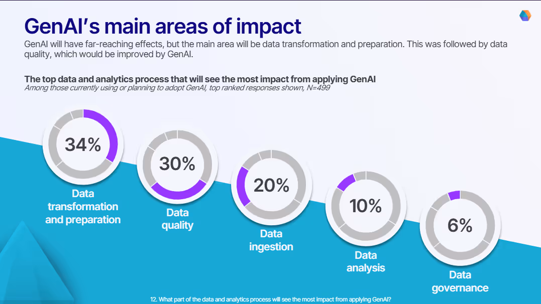
When combined with GenAI, visual tools can simplify each step of the data pipeline creation process, as our survey on the impact of GenAI on data teams highlights. With transformation and preparation simplified and data quality improved, pipeline complexity will significantly decrease.
Visual pipeline tools can help in understanding complex data relationships more easily by providing a clear visual representation, which may enhance the onboarding experience for users.
Waterfall Asset Management’s move to visual pipelines relieved the load of data engineering requests from the business team. The data engineering team’s choice of a visual tool, helped them deploy self-service analytics to business users, putting the power in the hands of business users.
Visual data pipelines reduce errors
Hand-coded data solutions can go wrong in many ways—syntax errors from typos, logical errors in algorithms, data type mismatches, inconsistent naming, and poor error handling.
Visual data pipeline tools fix these issues with intuitive interfaces and drag-and-drop functionality. This approach cuts down on syntax errors and logical mistakes by letting users focus on the overall data flow instead of getting lost in code details.
Most visual pipeline tools include automated checks that validate data types, formats, and relationships. These catch errors early, before they spread through the entire pipeline.
The clear, visual representation makes it easier to spot logical errors or inconsistencies. Pre-built, tested components for common operations ensure consistency and reduce risks associated with custom code.
Visual tools also provide immediate feedback on data quality and performance, helping users quickly identify and fix issues. Built-in version control and collaboration features help teams track changes, review each other's work, and maintain consistency.
By reducing errors and improving data quality, visual data pipelines build trust in data-driven decisions. When business users can see how data is processed, they're more likely to trust and act on the insights from that data.
Visual data pipelines increase speed to insight
Visual data pipelines dramatically cut the time between data collection and actionable insights by allowing rapid prototyping and testing. These intuitive interfaces let both technical and non-technical users quickly design, implement, and modify data pipelines without extensive coding knowledge.
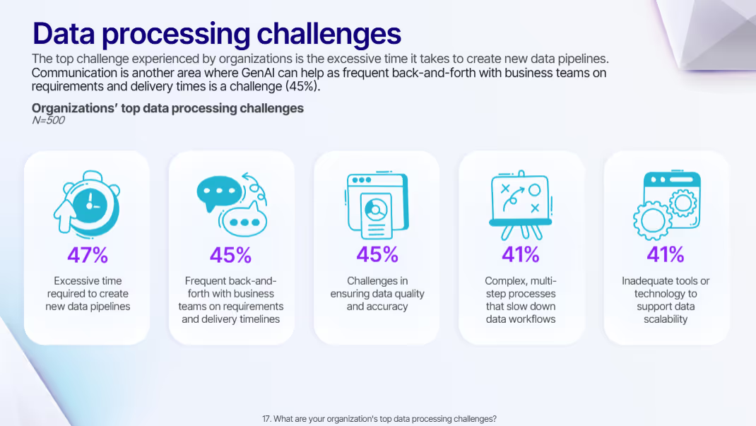
A Fortune 50 medical device pharma was experiencing 12-week-long data pipeline development timelines due to the constant back-and-forth between business and technical teams. This is a distressingly common scenario, as our survey highlights.
47% of respondents highlight the time it takes to create data pipelines as a significant hurdle that GenAI can alleviate, along with the back-and-forth between business and technical teams.
Joe Greenwood, VP of Global Data Strategy at Mastercard, explains that traditional workflows often lead to situations like these. Business teams face shifting priorities that need immediate attention. In traditional workflows, these changes require IT tickets, resulting in weeks or months of waiting due to competing priorities and limited resources.
This delay creates a significant business impact, as opportunities may be lost while waiting for data changes. Self-service visual pipeline tools fundamentally change this dynamic by allowing business teams to adapt their data workflows in real-time as priorities shift.
For instance, marketing teams needing to quickly analyze campaign performance can make adjustments without waiting for data engineering support.
Self-service creates a more efficient division of labor where business users handle routine data transformations and analyses themselves, while technical teams focus on more complex problems, infrastructure, and governance. Greenwood describes this as "meeting business users where they are" - enabling them to work with data directly without having to become deep technical experts, while still maintaining connections to the broader data ecosystem.
Self-service, therefore, doesn't mean independence from technical teams. Instead, it creates collaboration where business users can quickly prototype and test ideas, while technical teams provide support, optimization, and governance. This balanced approach helps organizations use their data fully while maintaining data integrity.
Visual data pipelines support self-service without sacrificing governance
Modern visual pipeline tools weave governance features directly into the interface, making compliance part of the workflow rather than separate policies. Visual interfaces display critical governance information alongside data flows, including data ownership, sensitivity levels, usage restrictions, and quality metrics.
Role-based access controls determine what different users can see and modify within the data pipeline. These controls can be represented visually through color-coding, icons, or interface elements that clearly show permitted actions for each user.
Visual interfaces can also display governance information such as data ownership, sensitivity levels, usage restrictions, and quality metrics alongside the data flows. This visibility helps users understand compliance requirements as an integral part of their work rather than as separate policies they need to consult.
M&T Bank’s Foster describes how the company implemented what he called "seamless governance" through their visual pipeline tools.
He outlines their approach of automating entitlements based on three key factors: a user's role definition, geographical location, and the sensitivity of the data they're trying to access. The system automatically triangulates these three factors to determine appropriate access levels without requiring manual approval processes.
For example, someone in a marketing role based in the US might automatically receive access to certain customer data, while the same role in another region might have different access based on local regulations.
This automated approach dramatically reduces the frustration that typically leads users to circumvent governance processes. Without automation, users often create their own databases or data copies to avoid long approval workflows, creating data silos and compliance risks.
When governance is embedded into the visual interface and automated appropriately, Foster says, "people don't resist - they see it as enablement rather than restriction," which leads to higher compliance rates and better data practices overall.
Accelerate insights from your visual data pipelines
As data gets more complex and engineering team workloads increase, companies must change how they think about building data pipelines. Visual, low-code, AI-assisted tools bridge the gap between technical and business teams, erasing silos along the way.
Prophecy's visual tools offer a solution to these challenges:
- Intuitive visual interface for designing and managing data workflows
- Pre-built connectors and transformations to streamline pipeline creation
- Real-time data preview and validation capabilities
- Version control and collaboration tools for cross-functional teamwork
- Built-in data quality checks and error handling mechanisms
Using these features, organizations can reduce time-to-insight, improve data quality, and empower both technical and business users to contribute effectively to data projects.
To learn more about how you can reposition data ingestion in your organization and deliver self-service insights to business teams, read The Death of Traditional ETL, by Kevin Petrie, VP of Research at BARC.

Ready to give Prophecy a try?
You can create a free account and get full access to all features for 21 days. No credit card needed. Want more of a guided experience? Request a demo and we’ll walk you through how Prophecy can empower your entire data team with low-code ETL today.
Ready to see Prophecy in action?
Request a demo and we’ll walk you through how Prophecy’s AI-powered visual data pipelines and high-quality open source code empowers everyone to speed data transformation
Get started with the Low-code Data Transformation Platform
Meet with us at Gartner Data & Analytics Summit in Orlando March 11-13th. Schedule a live 1:1 demo at booth #600 with our team of low-code experts. Request a demo here.
Related content
A generative AI platform for private enterprise data
Introducing Prophecy Generative AI Platform and Data Copilot
Ready to start a free trial?
Lastest posts

The Future of Data Is Agentic: Key Insights from Our CDO Magazine Webinar

Analytics as a Team Sport: Why Data Is Everyone’s Job Now

12 Must-Have Skills for Data Analysts to Avoid Career Obsolescence

